Journal
In this 3 part series we look at the best colours for country house kitchens; looking at some of the many colour options that work beautifully, taking inspiration from right outside the back door.
You may have found it easy to choose the kitchen cabinet style, handles, taps, flooring and worktops, but the colour of your bespoke kitchen may require a little more thought. We consider the best colours for a country kitchen.

TIMELESS INSPIRATION
Paint colours may move in and out of fashion, but at Guild Anderson we produce cabinetry and kitchens that are timeless, with an overall aesthetic that feels as if they have always been part of that particular home, and this is the approach we apply when considering the best colours for country kitchens.
As paint colours have developed so have our clients tastes and in recent years they have shied away from a traditional country house kitchen aesthetic. Taking inspiration from the colours found in nature right outside their doors; creating a fresher and more refined palette of colours that are both modern and yet timeless. Nature has done the hard work for us, creating harmonious shades that we know already work together, so it seems only right to tap in to what we see around us.
Prairie-inspired yellows, grass or herb greens, blues from the sky or river, greys from the clouds and browns from the trees and fields; all stimulate us. You may have a favourite colour in mind, but nature-inspired colour will create a strong foundation for any country kitchen.
According to colour psychology, nature-inspired hues are the best for interiors as they soothe and invigorate

NATURAL SHADES OF GREEN
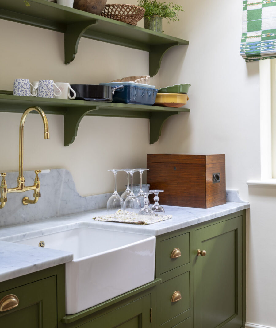
It’s not surprising that nature inspired green in various shades is a popular choice for a kitchen. Green creates a sense of calm and serenity and works beautifully with everything from blue to soft pink.
Three popular greens that work well in domestic spaces are Farrow & Ball’s Bancha; a modern green, a little darker than olive.
Little Greene’s Light Bronze Green; a magical colour that is exactly that, a mix of those two colours and works beautifully with French polished woodwork in the form of a bench and shelves.
Mylands Market Green; A wonderfully dramatic dark green named after Borough Market’s iconic iron building in London. A luxurious, unique and classic deep shade. The slight blue undertones of this dark, deep green paint help to give a calming effect, and the shade is perfect for bringing a natural, outside-in effect.
Bringing nature into your everyday life can benefit both your mental and physical wellbeing

WATERY SHADES OF BLUE
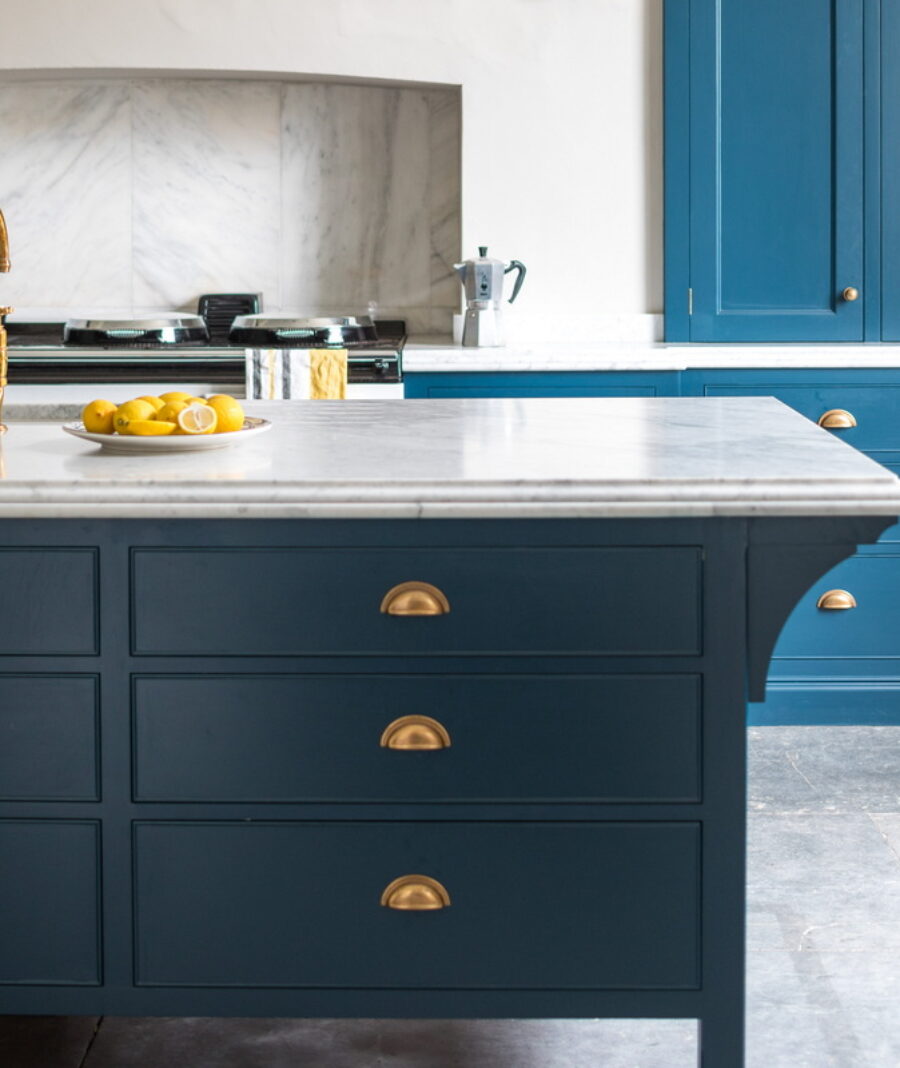
Although clients are beginning to move away from this classic combination; Guild Anderson have designed a significant number of kitchens over the past 20 years that have included a strong shade of blue for the kitchen island with an off-white neutral for the surrounding cabinets.
There are a multitude of blues to choose from; from dark shades that are nearly black or navy such as Paint & Paper Library Mockingbird; its takes its names from the deep, muted blue found in the structure of the Mockingbird’s feathers.
Or Farrow & Ball Railings; more blue than black, Railings is a softer alternative to black which is particularly suited to the ironwork it takes its name from.
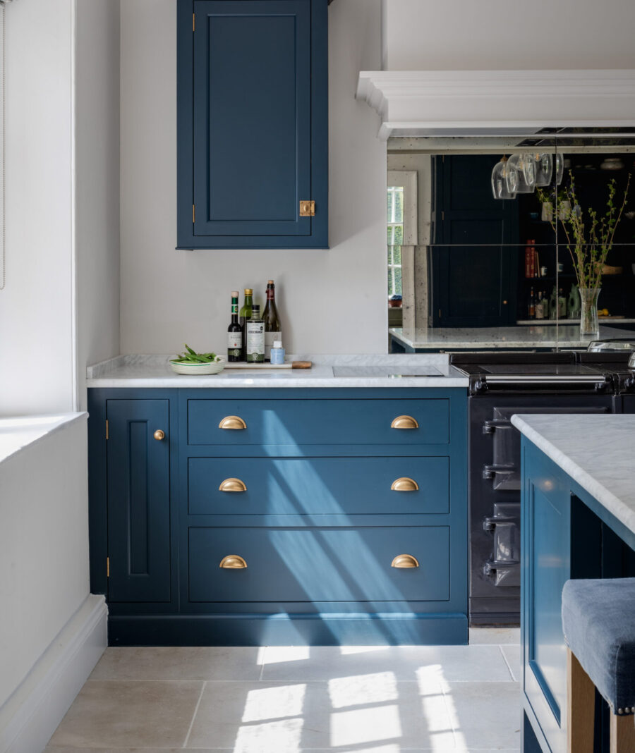
Cobalt, turquoise, sky or cornflower all give a lighter aesthetic, but overall this crisp combination of blue as the feature colour with a recessive neutral is easy to live with, timeless and clean looking. You may need to consider the orientation of your kitchen to ensure that blue you choose does not make the room feel too cold, but generally blue works well with metallics, natural wood and stone flooring as well as the infinite array of neutral whites, off-whites, greys and creams that you may use for the surrounding wall cabinets or walls.
Mylands Bedford Square; a blue reminiscent of a clear sky, clean whilst bringing a friendly and welcoming atmosphere. You will find this shade to be peaceful and naturally bright, with hints of neutral grey keeping it from becoming overbearing.
Mylands Burlington Arcade; a robust shade influenced by one of London’s earliest covered shopping arcades. The colour of this paint sits somewhere between green and blue, with an instantly fresh appearance. It can be a bold, bright choice for any modern home, or paired with dark shades to create depth and intimacy.
Blue and green create a refreshing interior and have a calming effect

TONES OF EARTHY BROWN
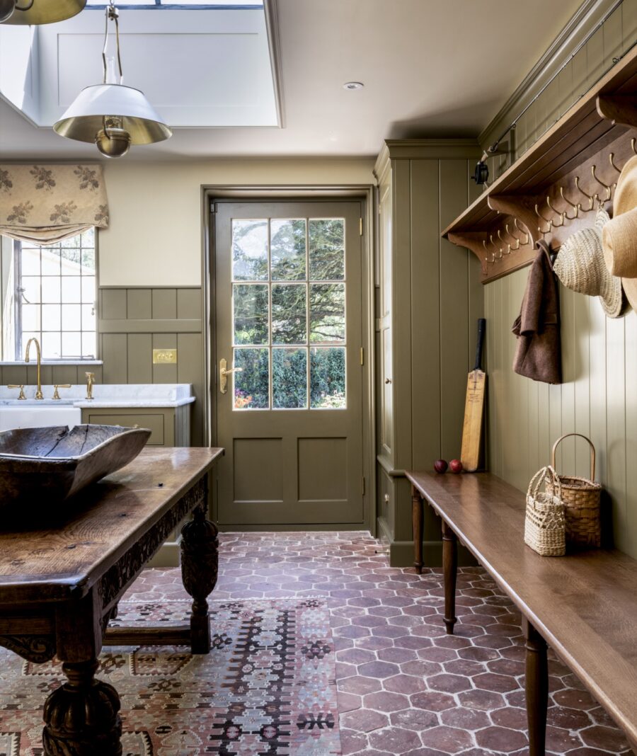
Brown and earthy tones are a fashionable choice at the moment, but it’s not surprising as they are excellent colours for hiding marks and splashes. With boot rooms comes mud, dogs and wellie boots and this is definitely a room where the right use of colour can be hugely beneficial.
Mylands London Brown is one of their archive colours; a warm dark brown with raw umber and burnt Sienna, it has a rich warmth from its deep red undertones. It can feel incredibly welcoming and earthy; whilst dark, it is still a friendly, comforting shade. They suggest contrasting it with paint colours like taupe, or other neutral light brown tones for an earthy, natural looking room.
Warm tones found in hard wearing terracotta tiles will finish the look of any country house kitchen or boot room; hexagonal terracotta floor tiles from Ca’ Pietra create the perfect welcome.


